DeskM Brand Collateral Kit
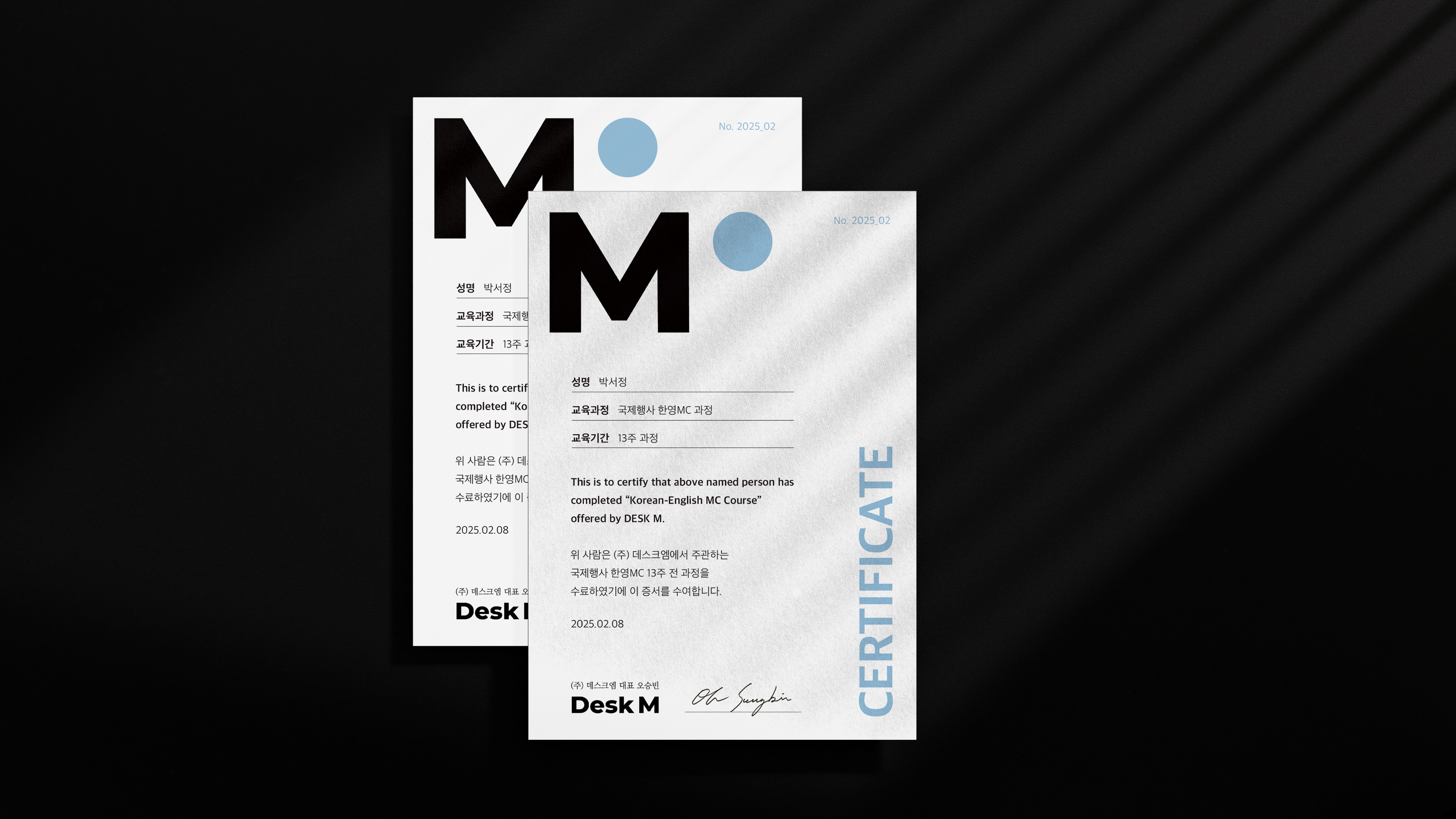
CERTIFICATE 시안 4종
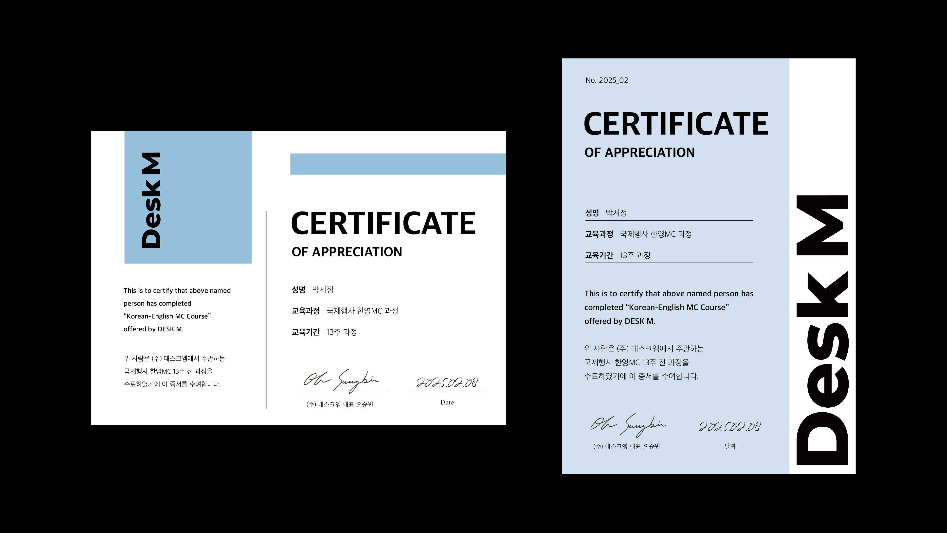
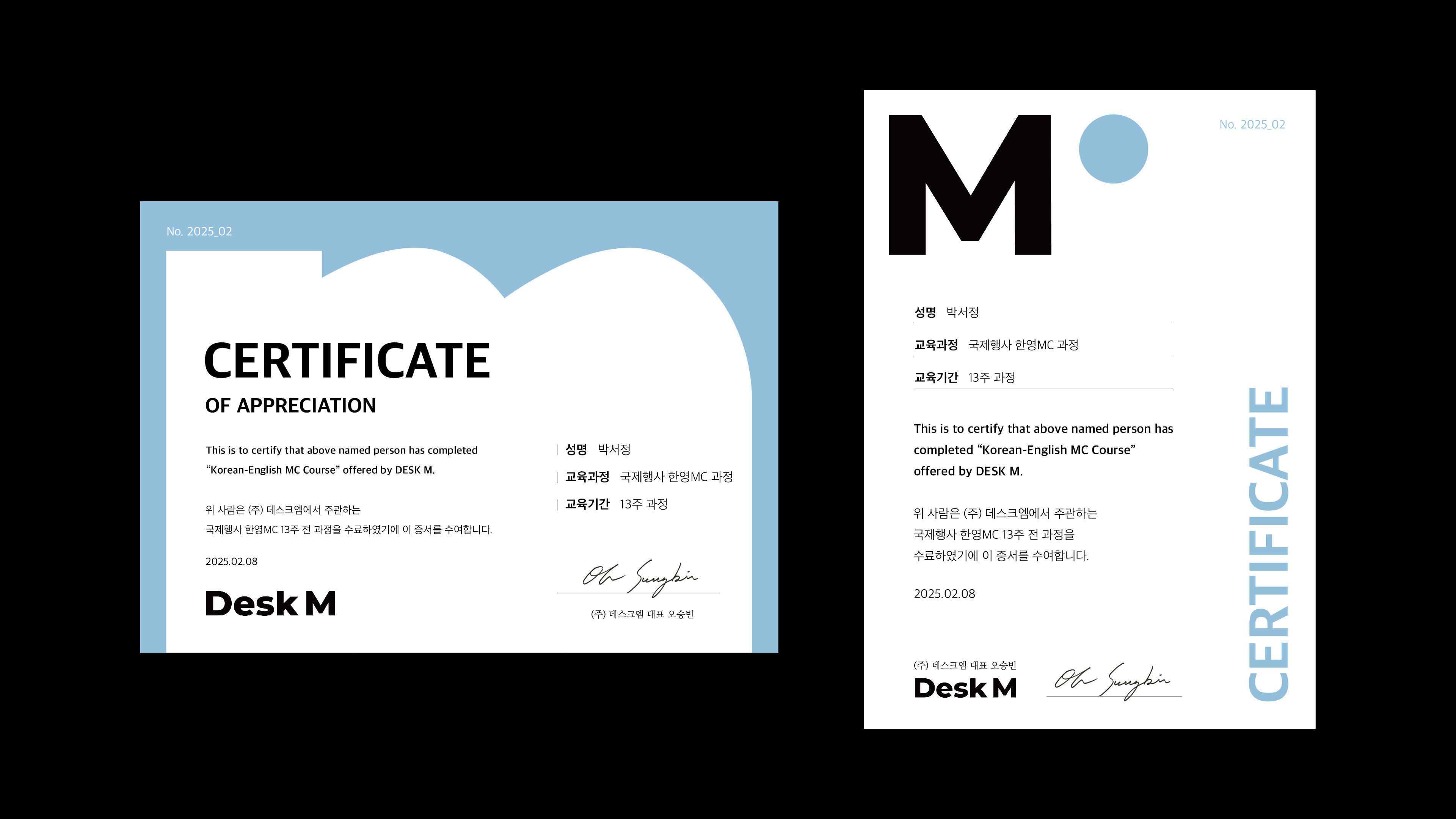
Certificate
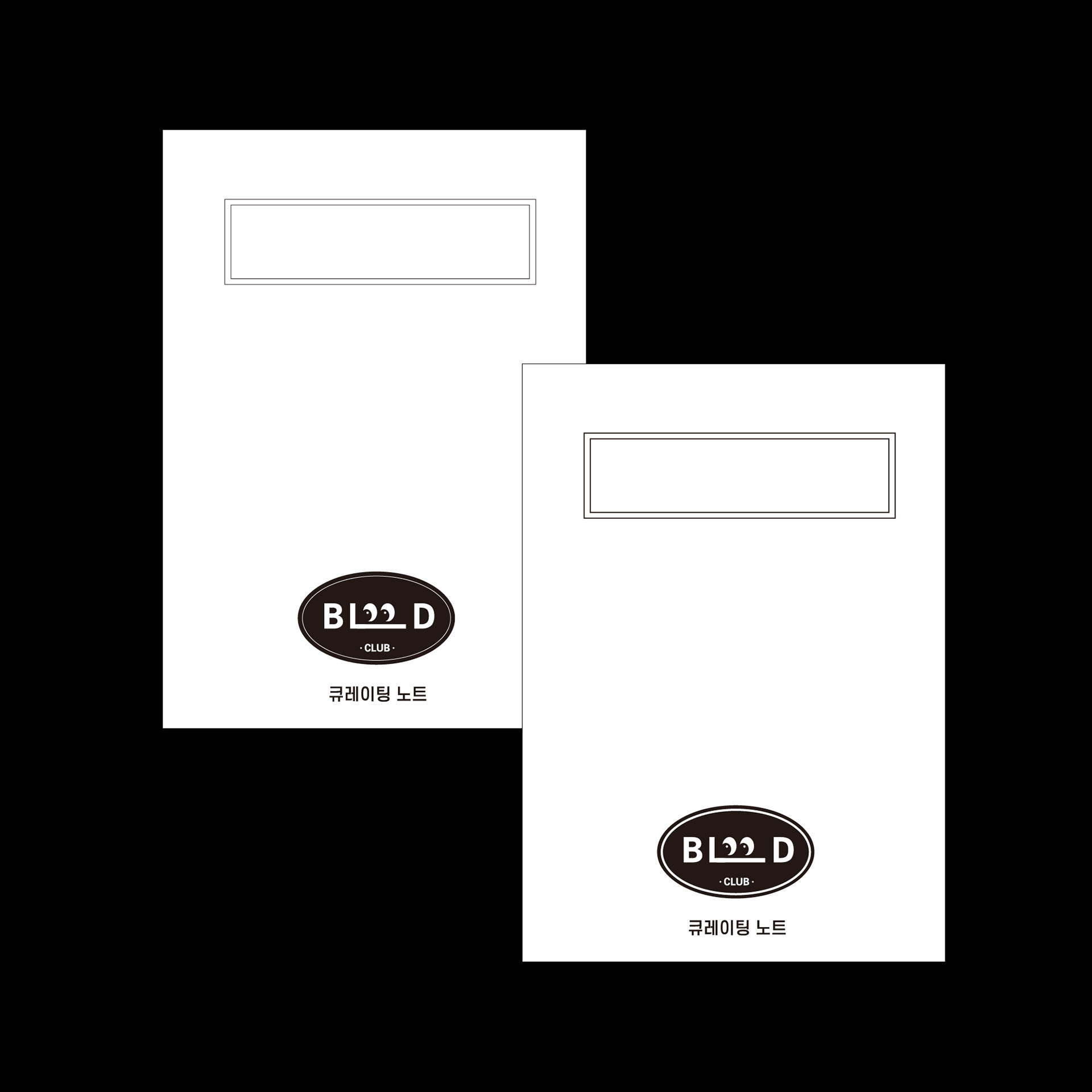
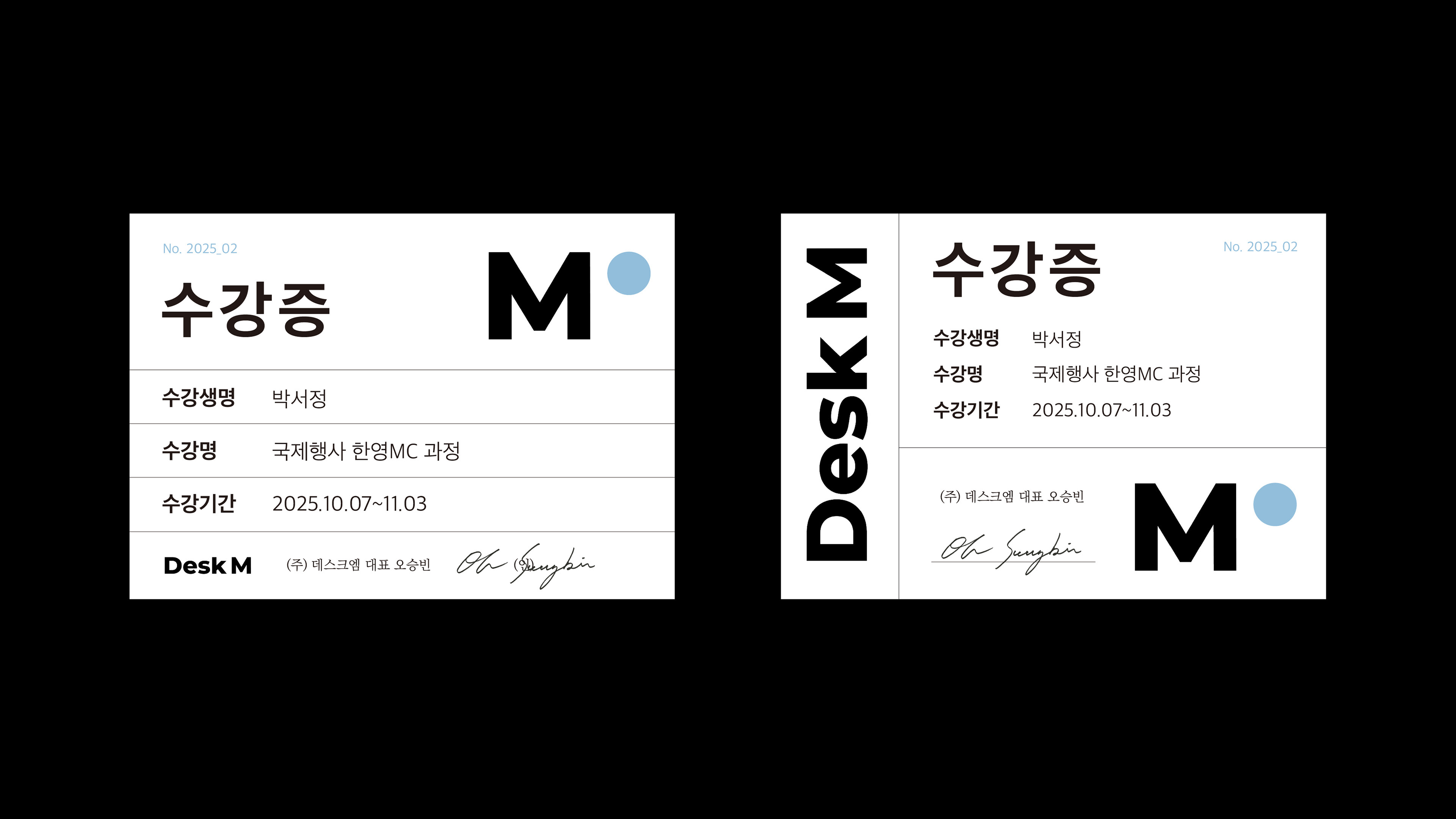
수강증 2종
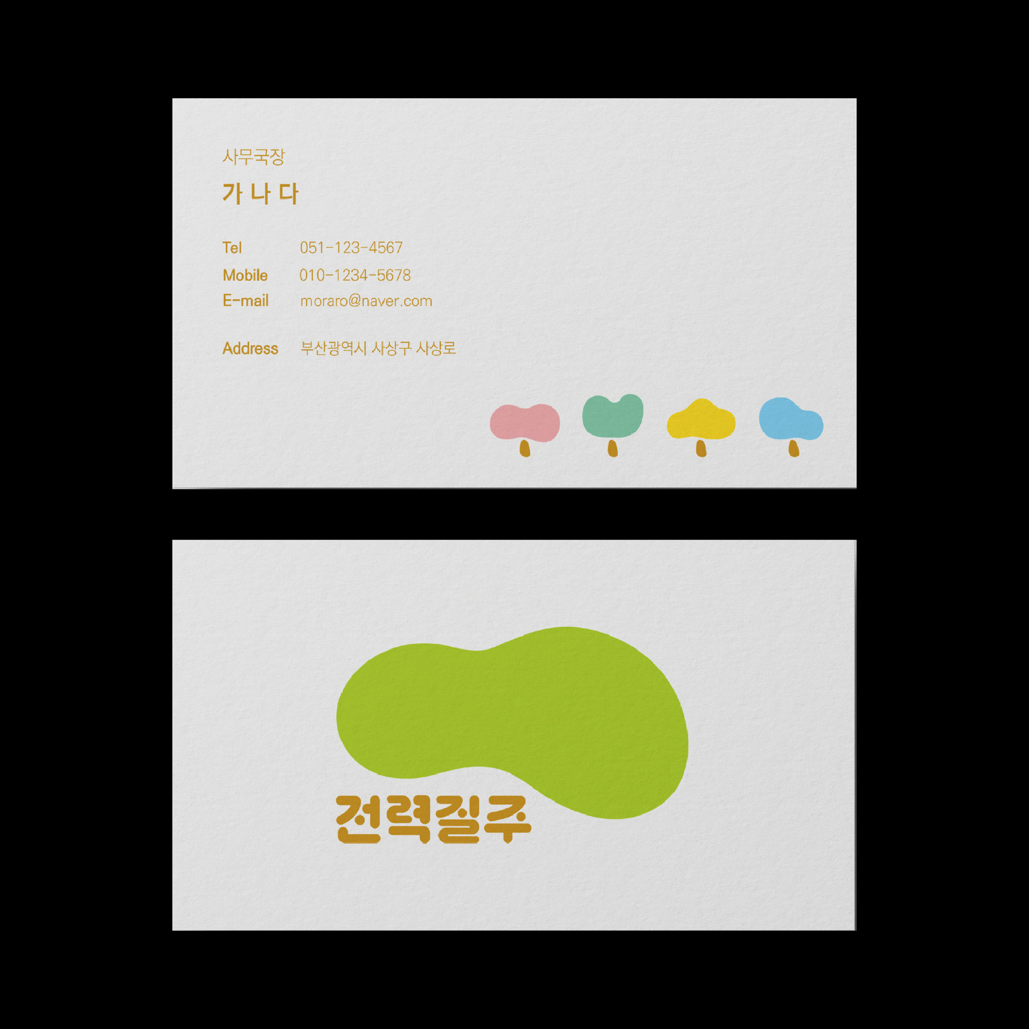
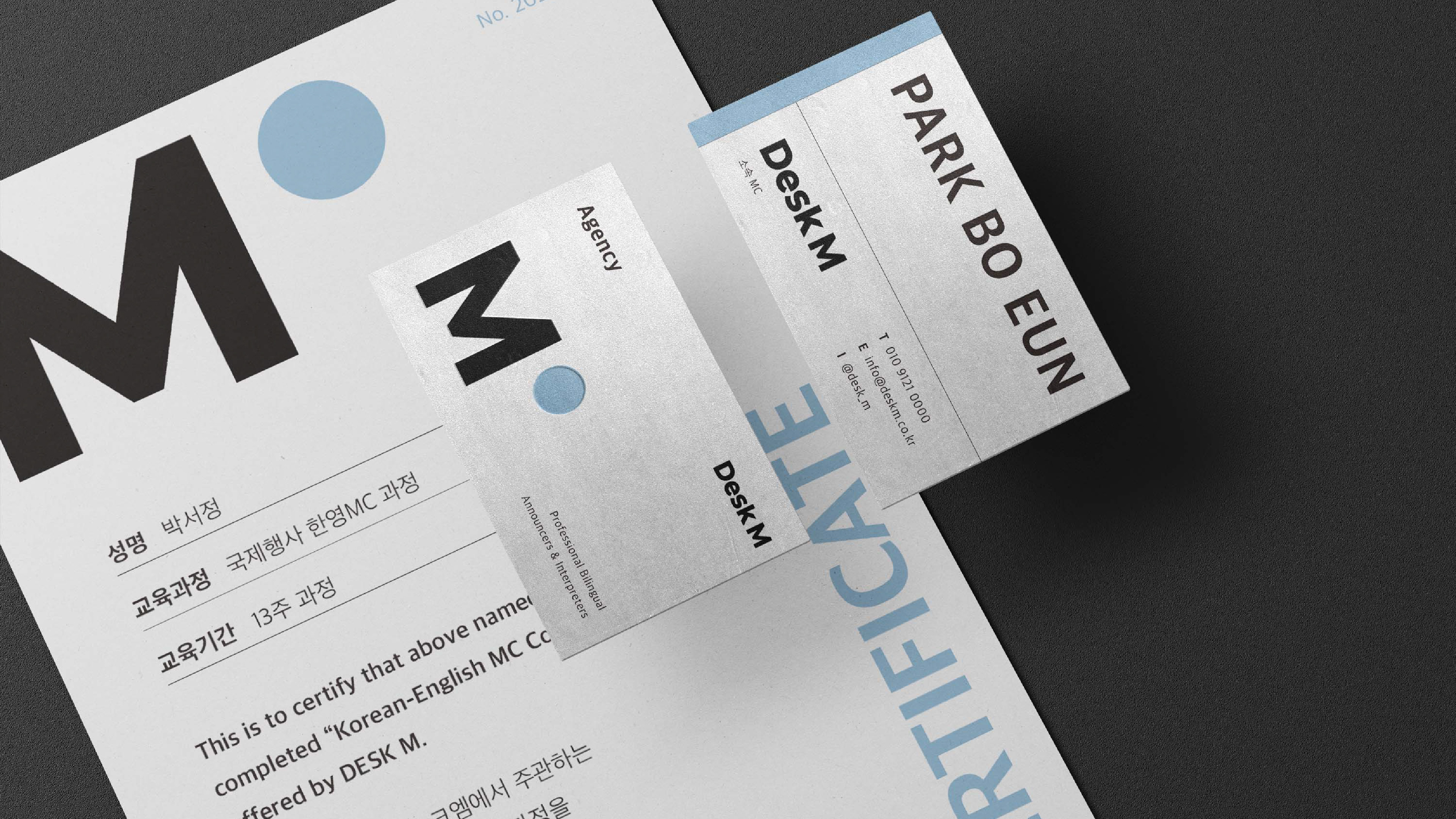
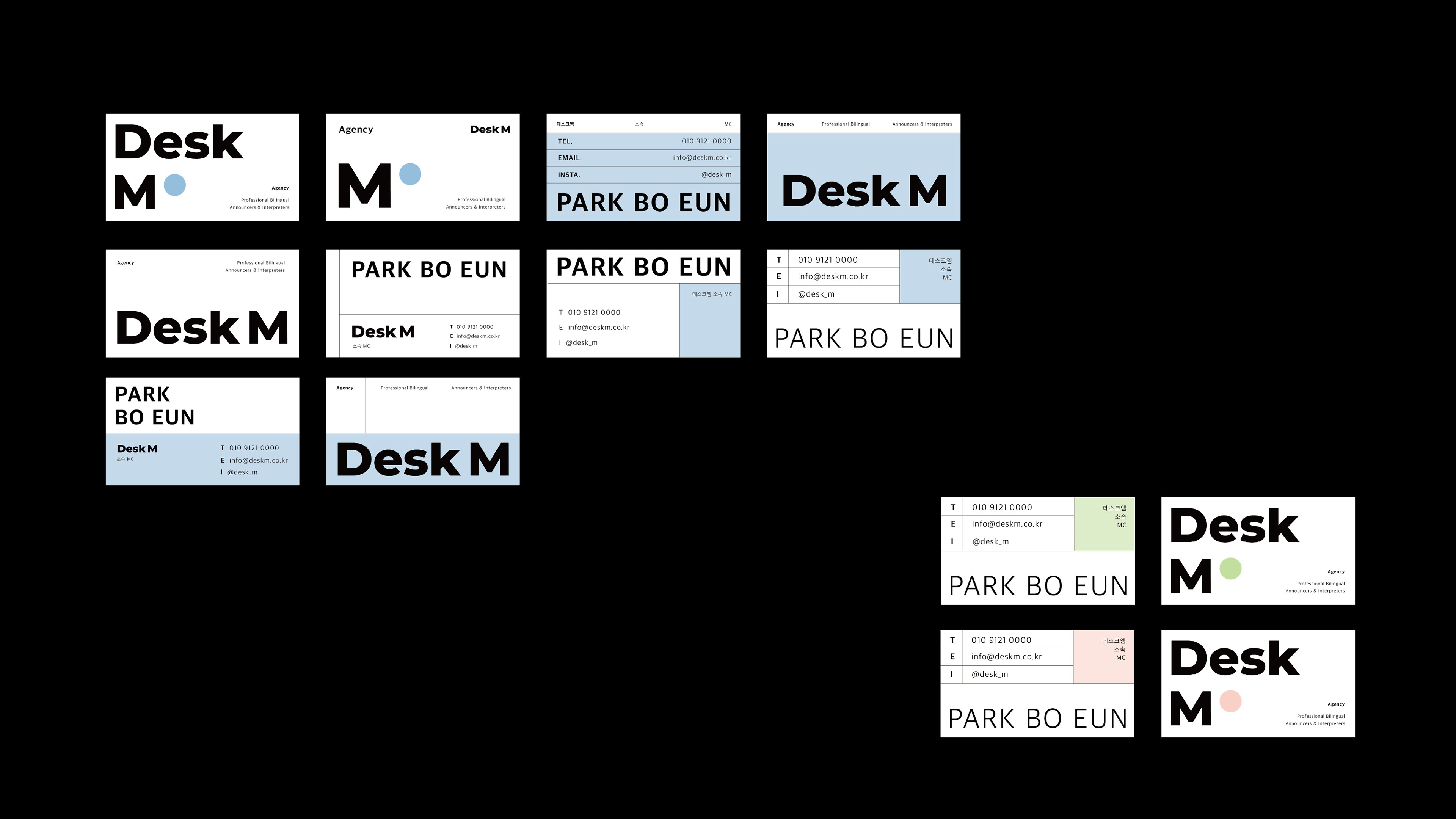
명함 시안 모음.zip
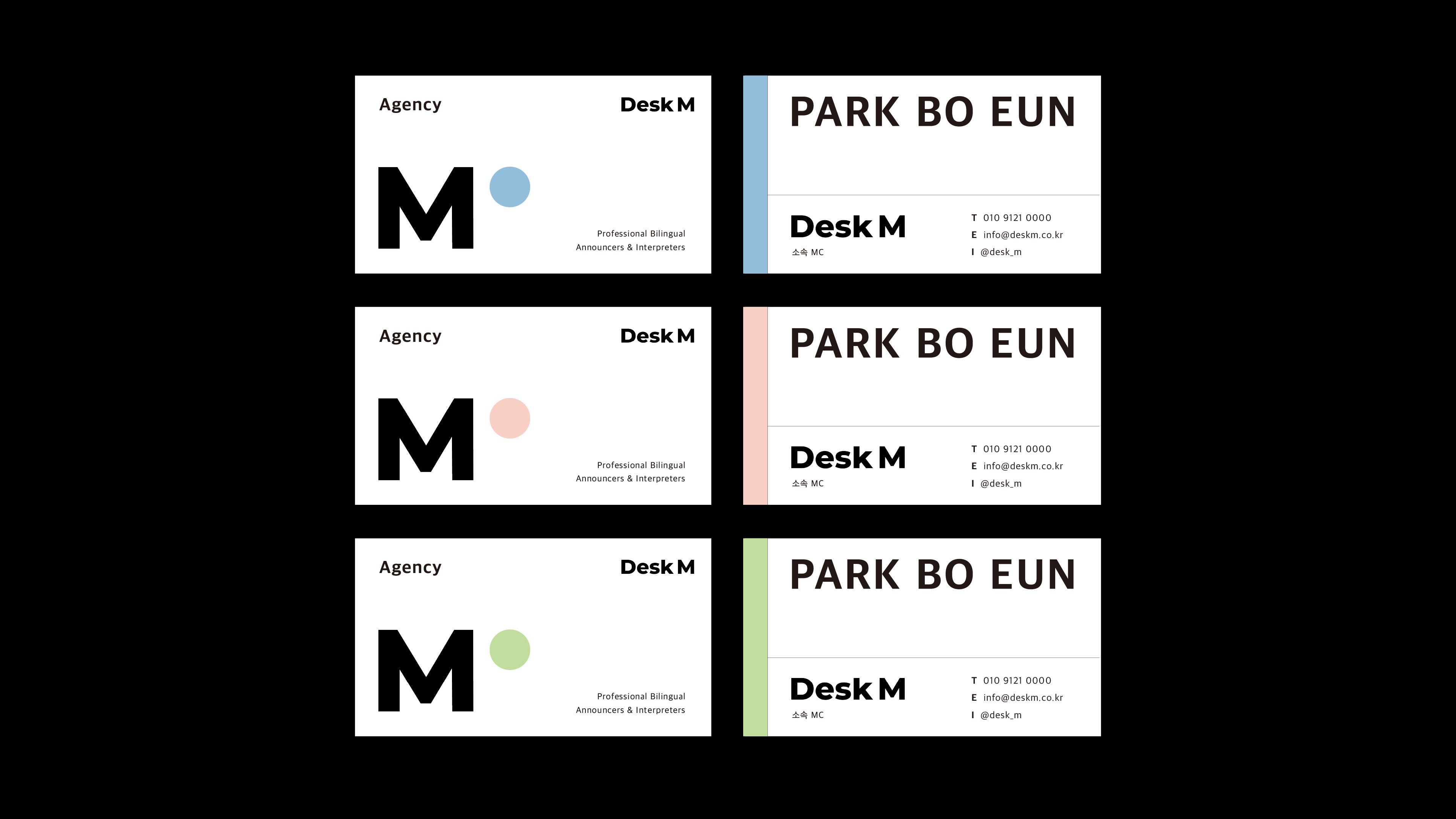
언어별 명함 3종 컬러 베리에이션
프로젝트 소개
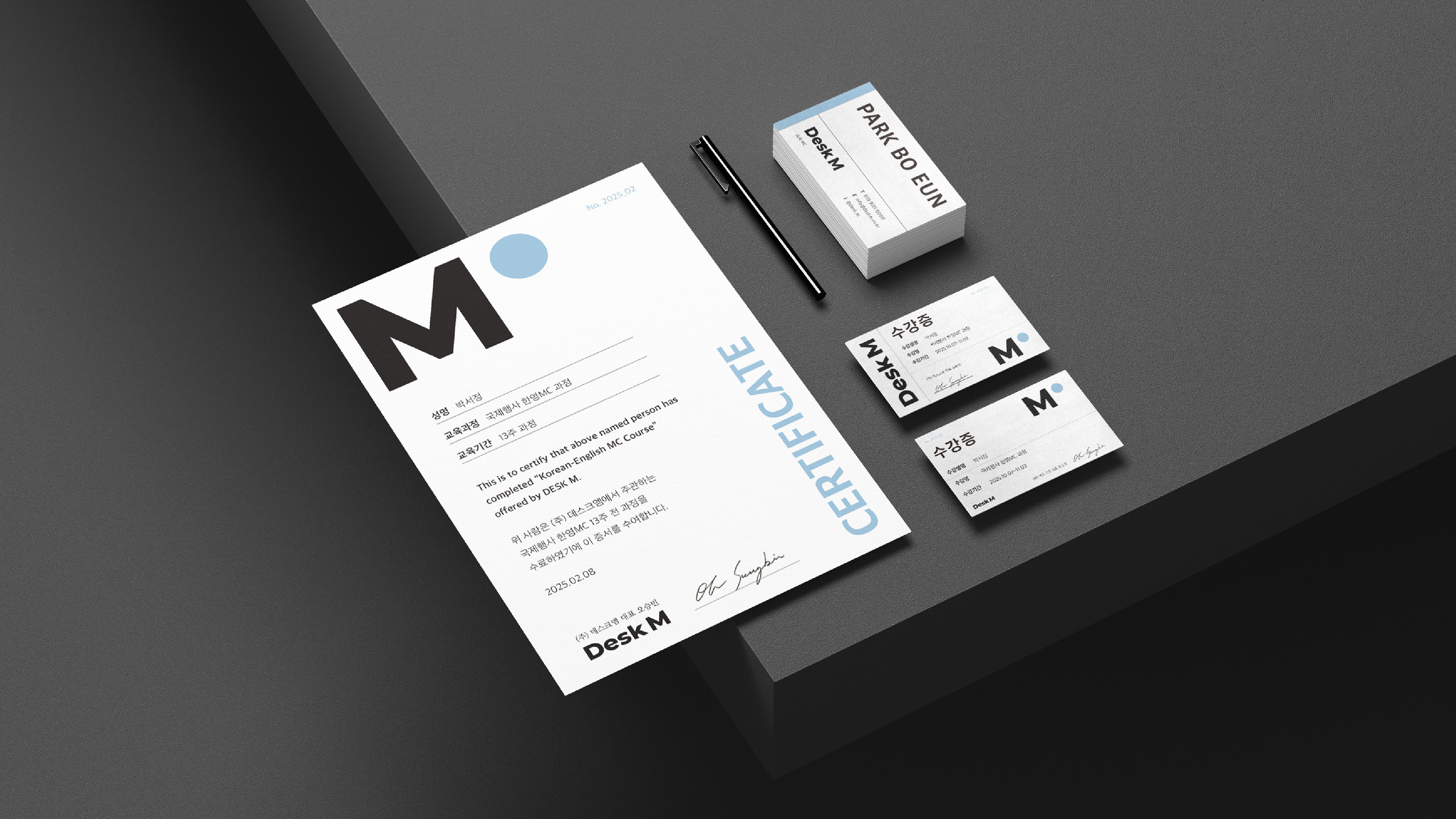
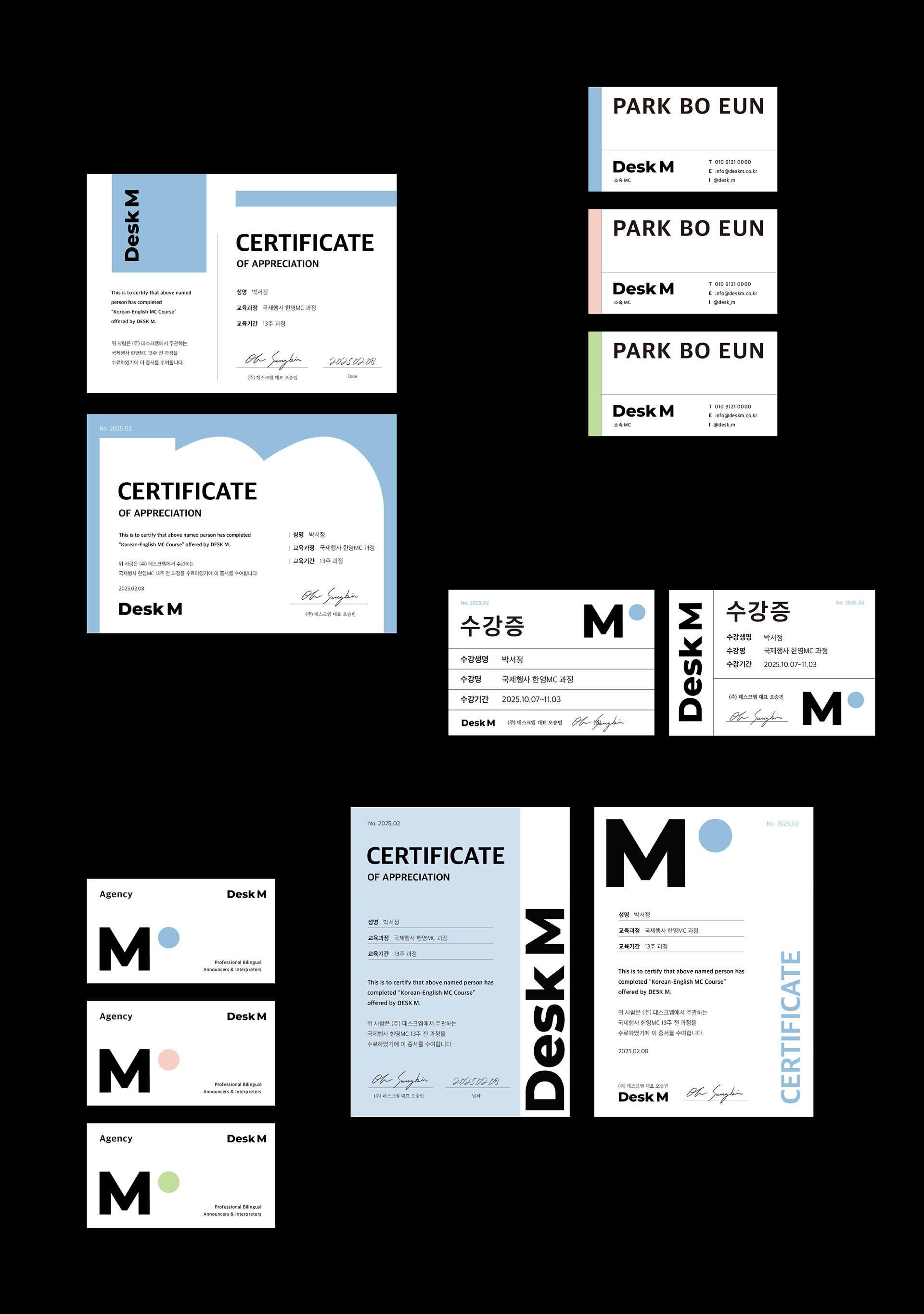
DeskM의 브랜드 톤을 실제 운영 접점에서 일관되게 전달하기 위해 명함·수강증·수료증(서티)으로 구성된 브랜드 콜래터럴 키트를 제작했습니다.
텍스트 정보가 많은 문서형 인쇄물에서도 브랜드의 인상이 흐려지지 않도록, 타이포 중심의 구조·그리드·여백을 핵심 언어로 설정하고, 간결하지만 기억되는 형태로 정리했습니다.
텍스트 정보가 많은 문서형 인쇄물에서도 브랜드의 인상이 흐려지지 않도록, 타이포 중심의 구조·그리드·여백을 핵심 언어로 설정하고, 간결하지만 기억되는 형태로 정리했습니다.
디자인 포인트
타이포그래피 우선 설계: 정보 전달력(가독성)과 브랜드 인상(리듬감)을 동시에 확보
그리드 기반 레이아웃: 명함/수강증/수료증이 서로 다른 비율이어도 같은 시스템으로 보이도록 통일
컬러 포인트 운용: 언어 버전과 컬러 베리에이션을 통해 브랜드의 확장성과 응용 가능성 제시
문서형 디자인의 균형: 공식 문서의 신뢰감 + DeskM의 미니멀한 인상 유지
그리드 기반 레이아웃: 명함/수강증/수료증이 서로 다른 비율이어도 같은 시스템으로 보이도록 통일
컬러 포인트 운용: 언어 버전과 컬러 베리에이션을 통해 브랜드의 확장성과 응용 가능성 제시
문서형 디자인의 균형: 공식 문서의 신뢰감 + DeskM의 미니멀한 인상 유지
결과물 구성
명함 시안 모음: 다양한 레이아웃 방향 테스트 및 구조 정리
최종 명함 3종: 컬러/언어별 베리에이션 최종안
수강증 2종: 동일 정보 구조를 다른 레이아웃으로 확장한 티켓형 출력물
수료증(서티): 시안 4종 전개 후 최종 1종 확정
명함 시안 모음: 다양한 레이아웃 방향 테스트 및 구조 정리
최종 명함 3종: 컬러/언어별 베리에이션 최종안
수강증 2종: 동일 정보 구조를 다른 레이아웃으로 확장한 티켓형 출력물
수료증(서티): 시안 4종 전개 후 최종 1종 확정
작업 범위
브랜드 시각 시스템 설정 → 레이아웃 시안 전개 → 최종안 선정 및 응용 디자인(수강증/수료증)까지 전 과정 디자인
브랜드 시각 시스템 설정 → 레이아웃 시안 전개 → 최종안 선정 및 응용 디자인(수강증/수료증)까지 전 과정 디자인
DeskM’s brand collateral kit designed to keep every touchpoint consistent and recognizable.
This set includes a business card, certificate template, and course pass—built as a cohesive document system that can be used across offline and operational contexts.
This set includes a business card, certificate template, and course pass—built as a cohesive document system that can be used across offline and operational contexts.
The visual direction focuses on clarity and usability: typographic hierarchy, clean layout grids, and balanced spacing to ensure information is delivered quickly while maintaining a refined brand tone.
Each asset was designed to work as a standalone piece, while also functioning as a unified kit when presented together.
Each asset was designed to work as a standalone piece, while also functioning as a unified kit when presented together.